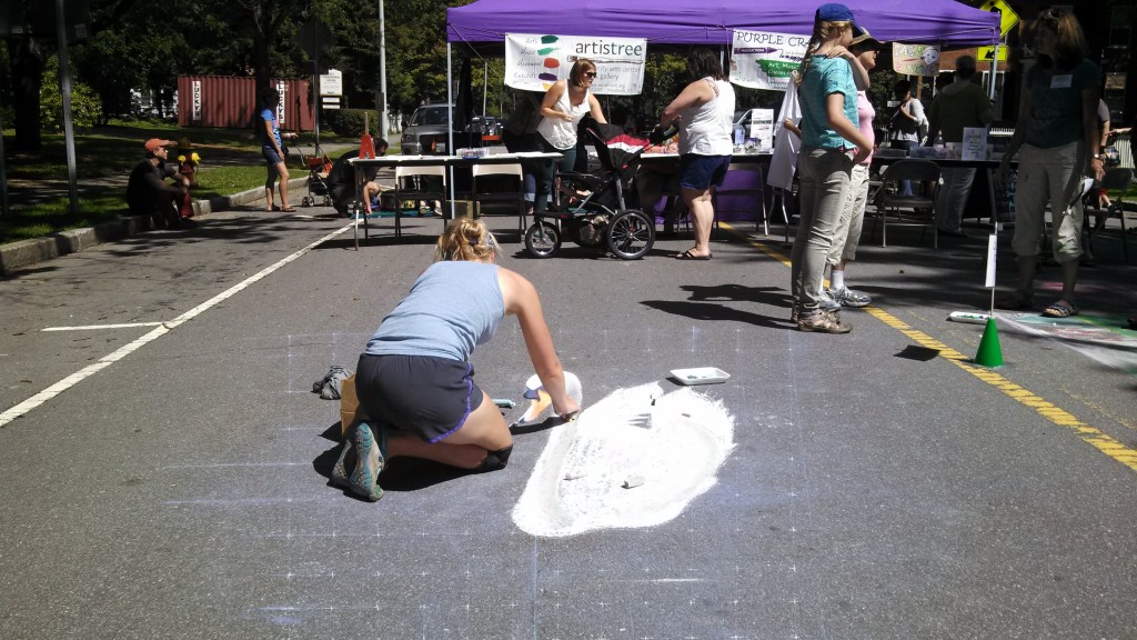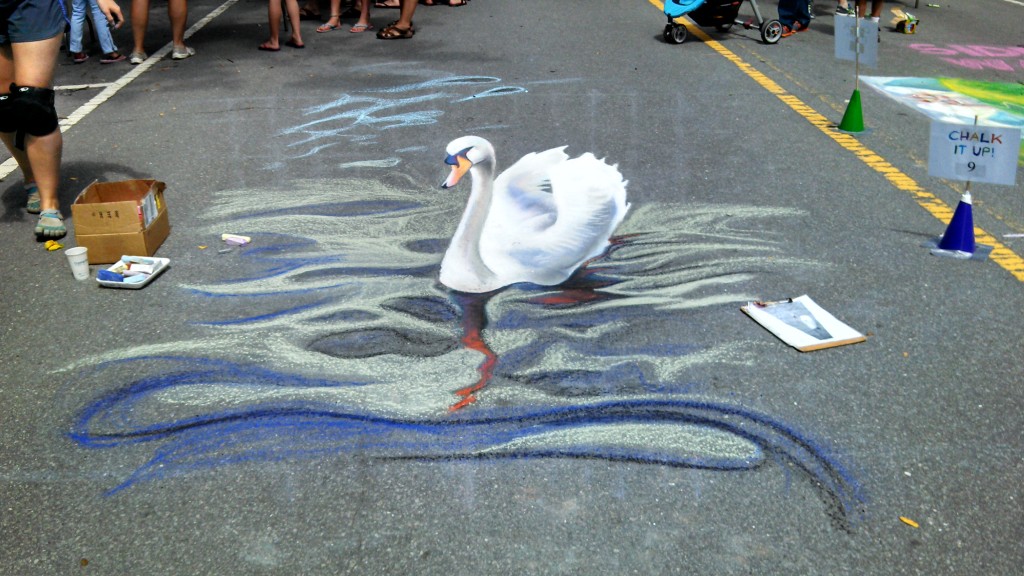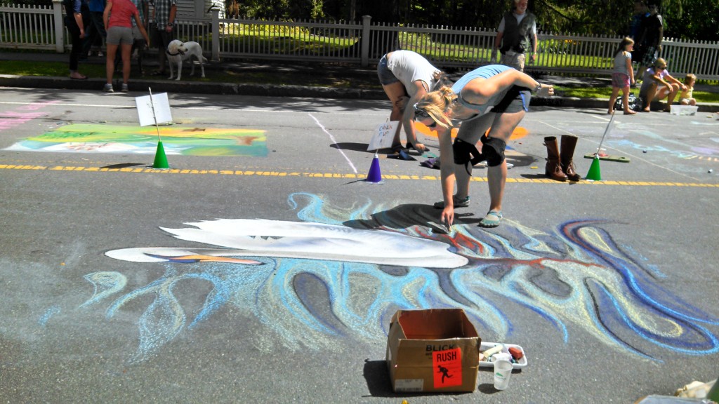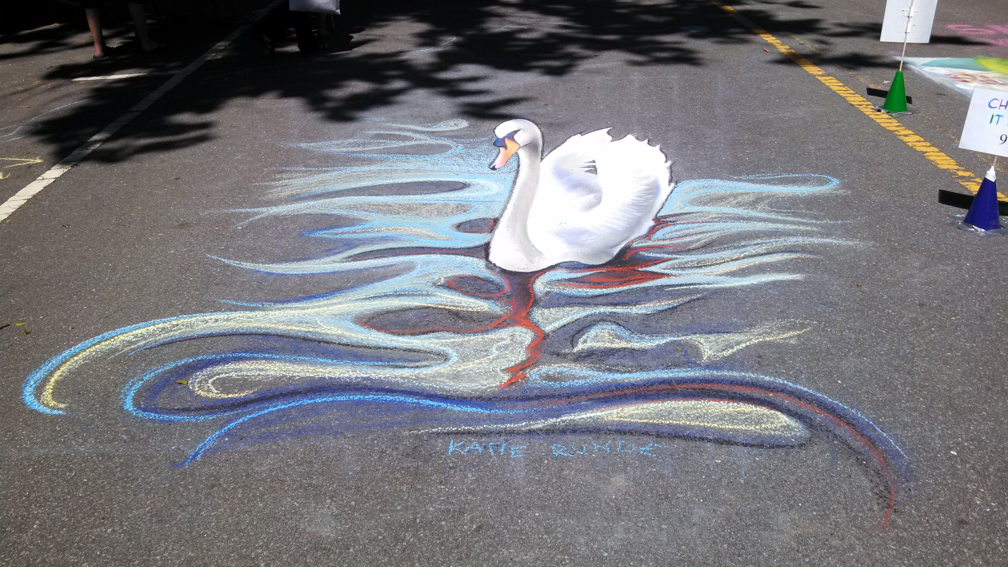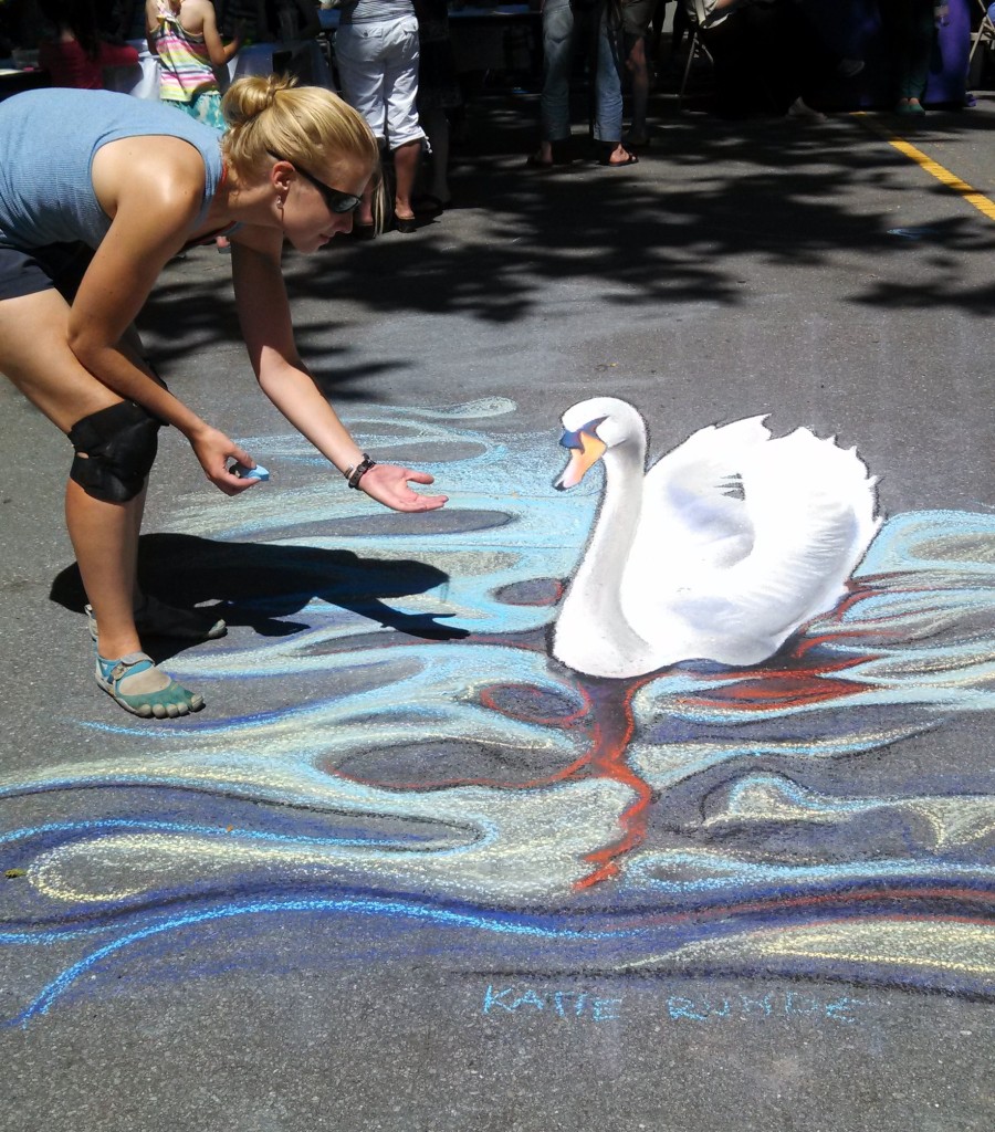

After scouring my photo stock and even the internet for good small 3D creatures one might be amused to find at random on the street, I compiled a lengthy list and sent it to a bunch of friends. Yeah, no one voted for the swan. They all went for the amazing ____ (which I will not disclose, as it will soon grace the Maltex lot in South Burlington for this year’s SEABA Art Hop) or the pigs (my original preference), but in the end given the limits of a 10′ x 10′ space and the 3-hour completion time, I decided on the swan.
The reference photo dates back to about…2008? This is a mute swan photographed at the Loch in Cork (Ireland), where I lived for three and a half years (in Cork, that is, not in the Loch). If it had not been a mute swan, in fact, its honking may have been inflected with that Cork sing-song lilt. Maybe in its swan song.
Anyway, this grid is much smaller than the usual twenty-footer business we work with, which was quite strange. As soon as I drew the swan in, I also realized that we’d left our viewing point at between 4′ and 5′ tall, making children the ideal viewers and requiring all adults to bend their knees to get the right view. Oh well. Why not?
One of the aspects of the swan that had initially appealed to me was its color simplicity. I knew this might be a little boring, but I was excited to be able to take that time to get into more detail instead of going crazy with color. As soon as I started drawing, though, I could not stop myself from pulling the fun colors out and trying to avoid gray (for goodness’ sake, a NON-COLOR) as long as possible. Olive green and lavender were a big help here.
Okay, you might ask, what is so horrible about gray? Nothing is substantively wrong with gray, I just have trouble with literal colors. I even had trouble with literal colors as a first grade teacher, showing the kids how to draw tree trunks with brown crayons and leaves with green—because those packaged colors are just so one-dimensional. They have no depth, no interest. Try it: grab some crayons and draw a tree like that above mentioned. Now, throw some blue on that brown and some yellow on that green, to be shaded with orange, red, or purple, perhaps with some blue for your mid-tones. Hopefully, this brings it to life a little bit.
This may have made for a couple classes of color-confused children (or at least children who know that a shadow on green grass is best expressed with red and/or purple), but I hope they will at least feel uninhibited by preconceived notions of color. The swan isn’t really white, just like the clouds are not really white. Without some yellows, blues, purples, greens, and even yellow ochre, that white will just lie there, dead.
There is Katie’s color soapbox. I will now step down.
(See? Not quite gray. It’s still alive. Okay, so I eventually caved and used some dark gray pastel to blend into the swan shadows towards the end for a low-hue dark, but it was not left alone to lie there like a limp rag.)
I am also happy to announce that much of this picture was possible with children’s chalk. Much as I love my Eternity Arts chalk (and much as people were ogling its bright colors and wonderful consistency), it is EXPENSIVE, so whenever I can use a Crayola or a stick from the giant tub Justin found me at Burlington Rite-Aid, I am grateful.
Those super undersaturated kids’ sidewalk chalk colors come in extra handy when working with a white subject.
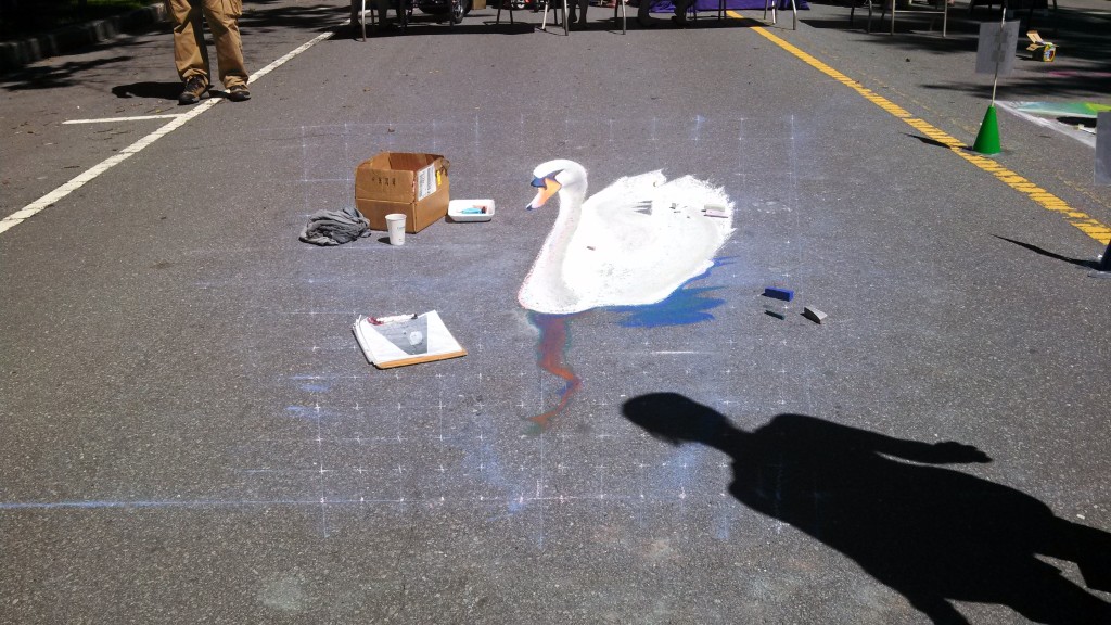
Okay, so here I was a bit flummoxed as to how to make gray for the swan’s shadow. Yes, gray! Sometimes you need a dull color, so how do you express it without losing its vibrance? If I got all literal about it, I’d be making the swan’s shadow the same gray as the road, which would be pointless. Black would just be a big hole for the eye to fall into. I played around by mixing some of these vivid darks.
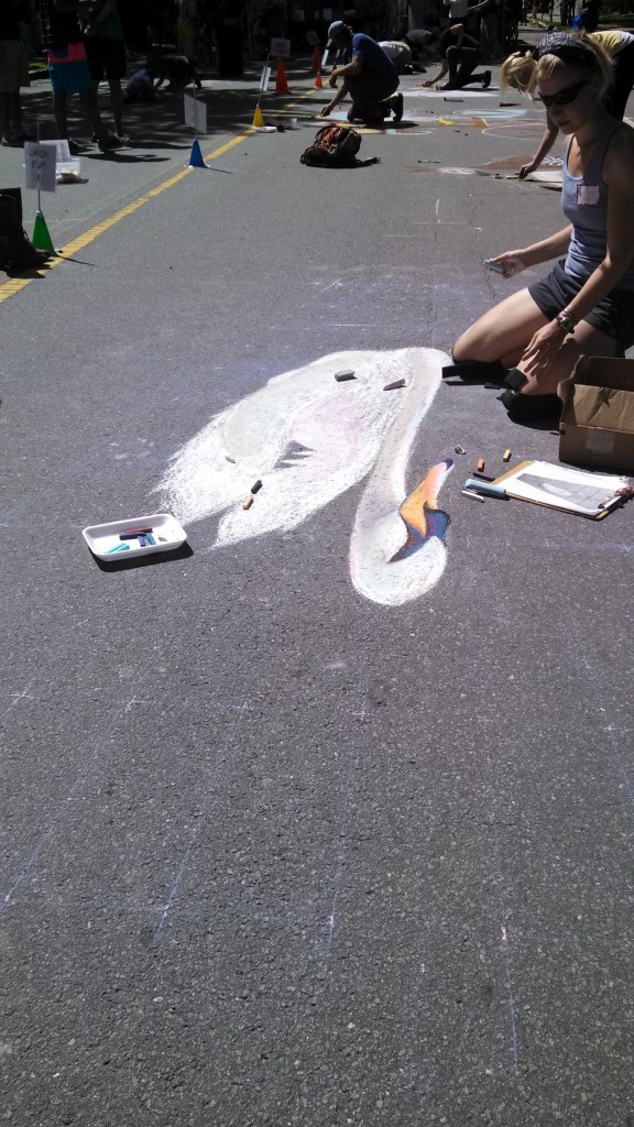
Then I got distracted by the utter lack of depth in my glaring white swan and went back to work on those feathers:
The next puzzle was how to get those waves to look okay without overworking them. In my reference photo, these were gray waves, no less, so here was the problem of gray again. All of my darks, however, were too abrupt to just draw in the wave shadows and leave the middle-gray as the road, a technique I’d been thinking about.
After blending my olive green into the road, I realized that the best mid-tone happened when I did not work the chalk into all the little pavement nooks in crannies. Justin, who had been helping the whole time by cleaning smudges, edges, and leftover grid off the road with a wet rag, came to the rescue and washed some of that yuckiness out. In the meantime, here I am looking in disdain at how airbrushed the swan looks.
I attended to the waves and that airbrushed look in disorganized bursts of scattered attention, first to one, then to the other, then to one, then to the other—which betray what very well may be some ADD on my part.
The trick to the airbrushed horror, I realized, was detailing the feathers. My reference photo, all 72 dpi of it, was not going to help much, so I had to make some up. Then I got in the swing of things and made up the water, too. I added the light highlights on the wavelets up top, hoping this would make the road into some sort of midtone. Fortunately, Justin came to the rescue again, and we got rid of the evidence.
This is where I got sick of that olive green, busted out the kids’ undersaturated blue, yellow, and green, and created some depth with color. I also added a dark gray (!) outline to help the swan pop up a little more from the road.
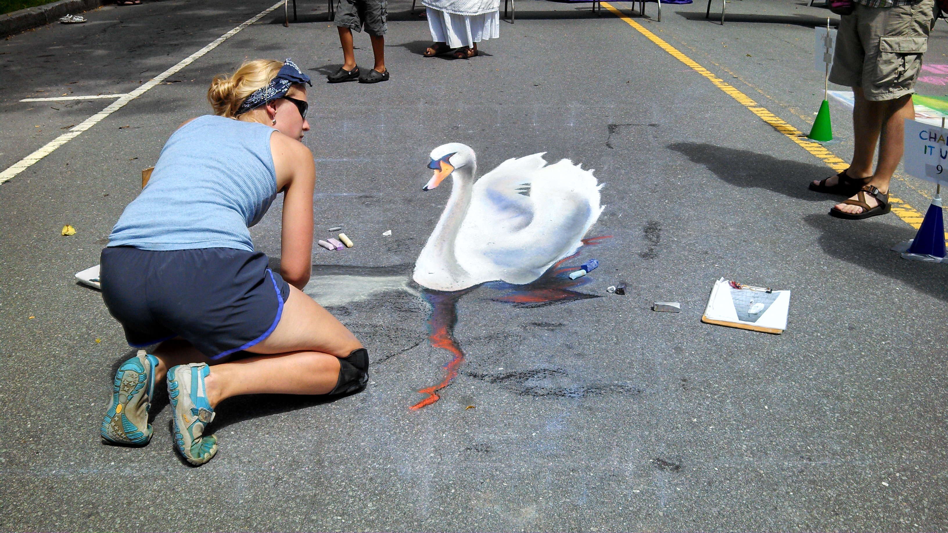
…And here it is, from kids’ eye level! I have to say, it was kind of sweet that for once parents who are always lifting their children to see better now had to stoop to see with their kid, who got the privilege of best-view…for once.
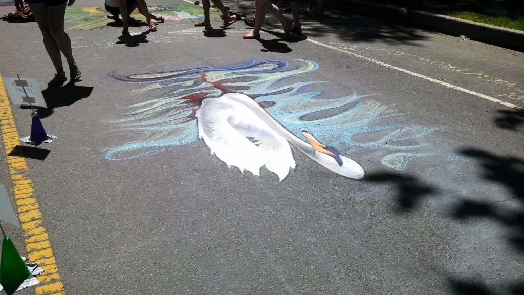
…From my favorite angle…
…and feedable! Done in under three hours with minimal gray.
